Where carbon emissions come from in 8 charts

There’s a great deal of confusion about where exactly greenhouse gas (GHG) emissions come from. There’s also the idea of “carbon-dioxide equivalents” and what exactly counts as a greenhouse gas. Today, I’m going to try and clear things up, using some nifty charts to give a baseline for thinking about GHGs and what exactly is causing our carbon-equivalent (another way of talking about GHGs) crisis.
-Mike
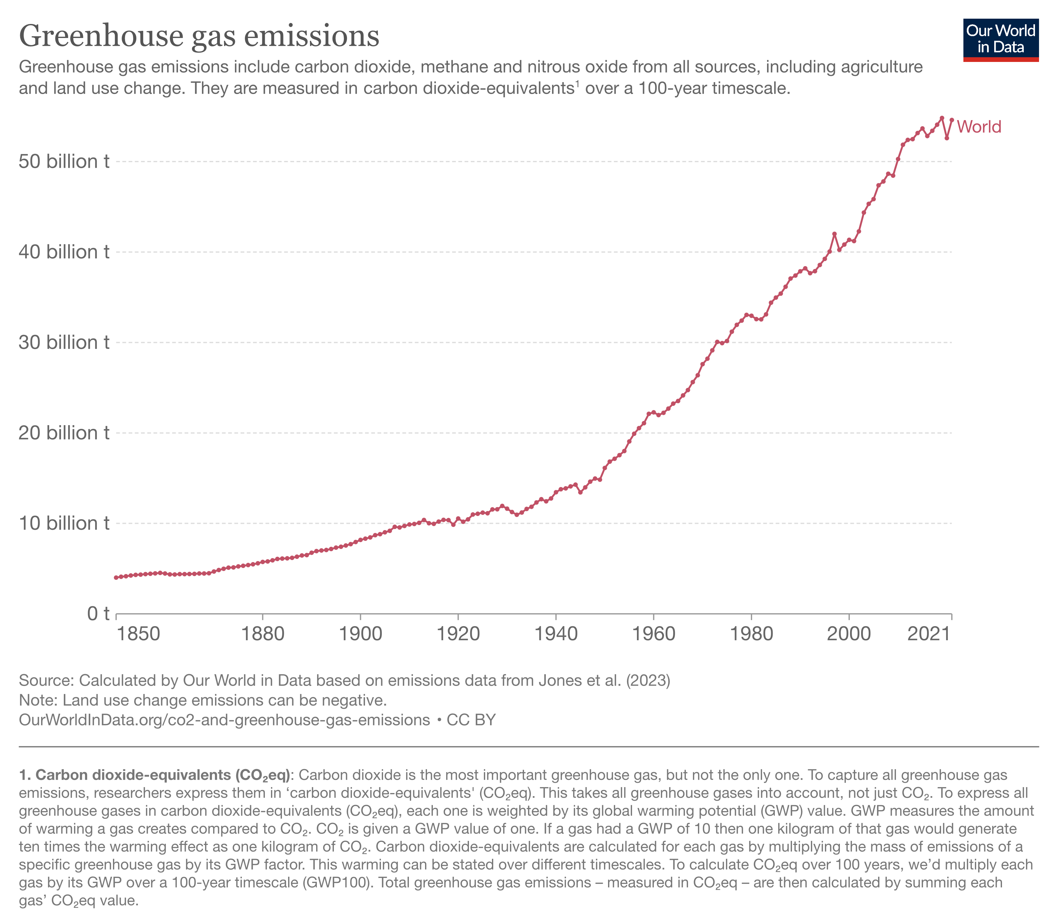
First, let’s talk about the thing you probably know. Overall emissions are getting way worse. (All of these charts are clickable to enlarge)
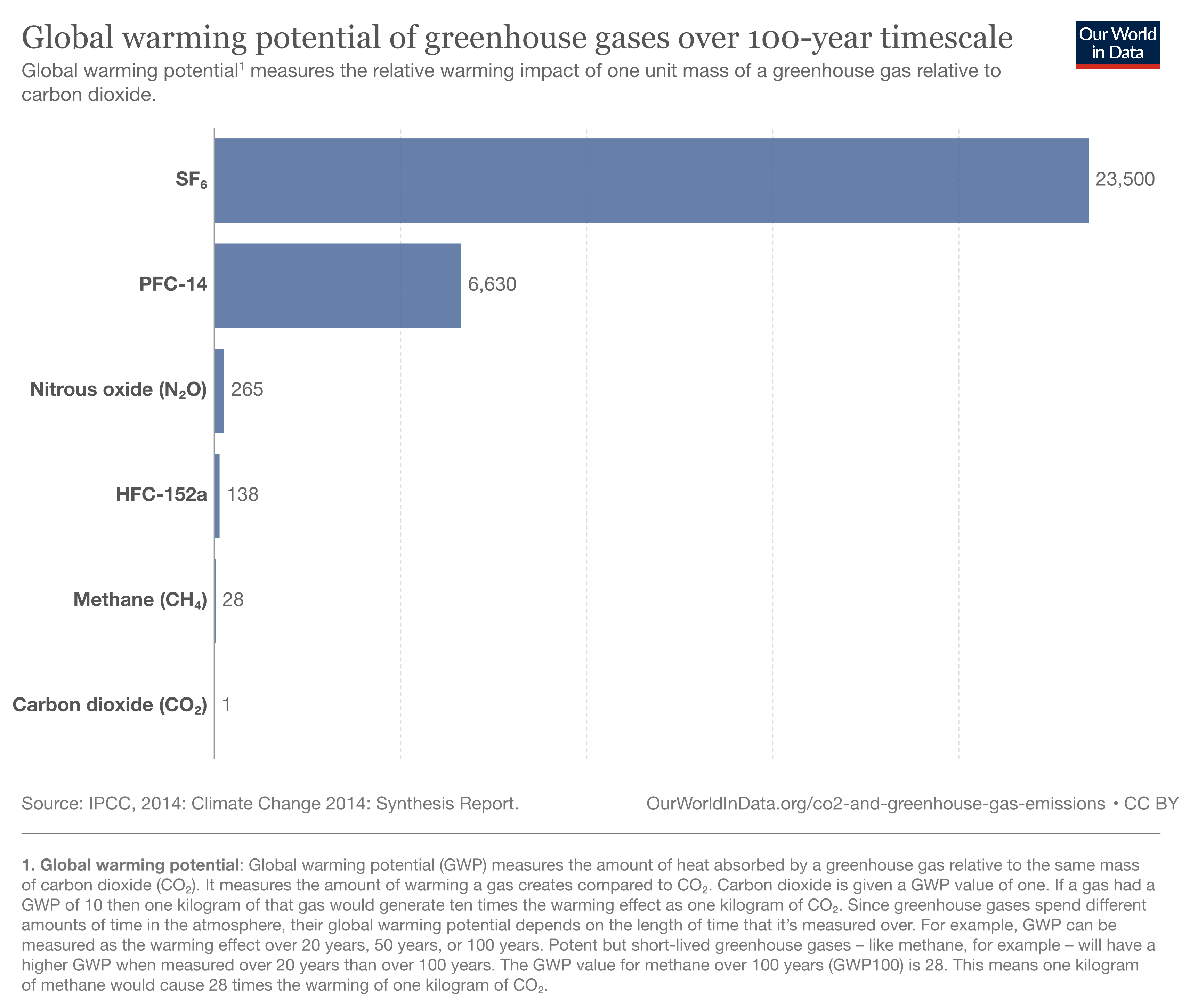
Second, what exactly are those emissions? There’s carbon-dioxide (CO2), the one you’ve probably heard about the most. But there’s also methane (CH4), which is the same stuff as “natural gas”, but also emitted as animal flatulence, from pools of dung, and also as a by-product of rice paddies. There’s also nitrous oxide (N2O), Hydrofluorocarbon (HFC), Sulfur hexafluoride (SF6) and others.
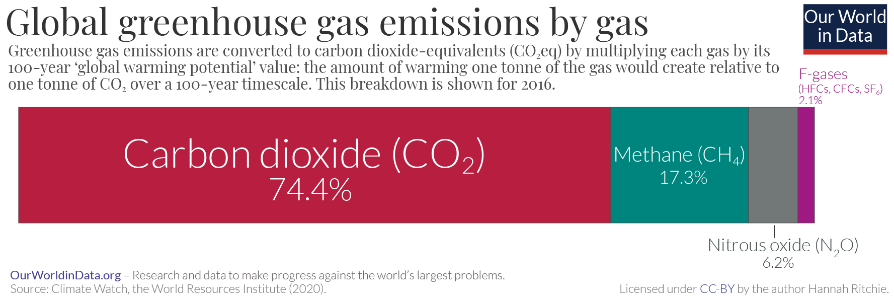
Different emissions have different strengths in terms of how much heat they trap within the atmosphere and how long they stay in the atmosphere before breaking down or absorption. Ultimately, not every GHG gas is equal, and as you can see by referencing the just above and the one below, while methane is not talked about as much as CO2, it probably has the biggest potential impact. Methane is also not tracked closely, since a great deal of methane escapes from old, uncapped gas and oil wells across the world. We are likely leaking more methane into the air than we know.
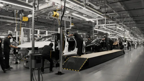
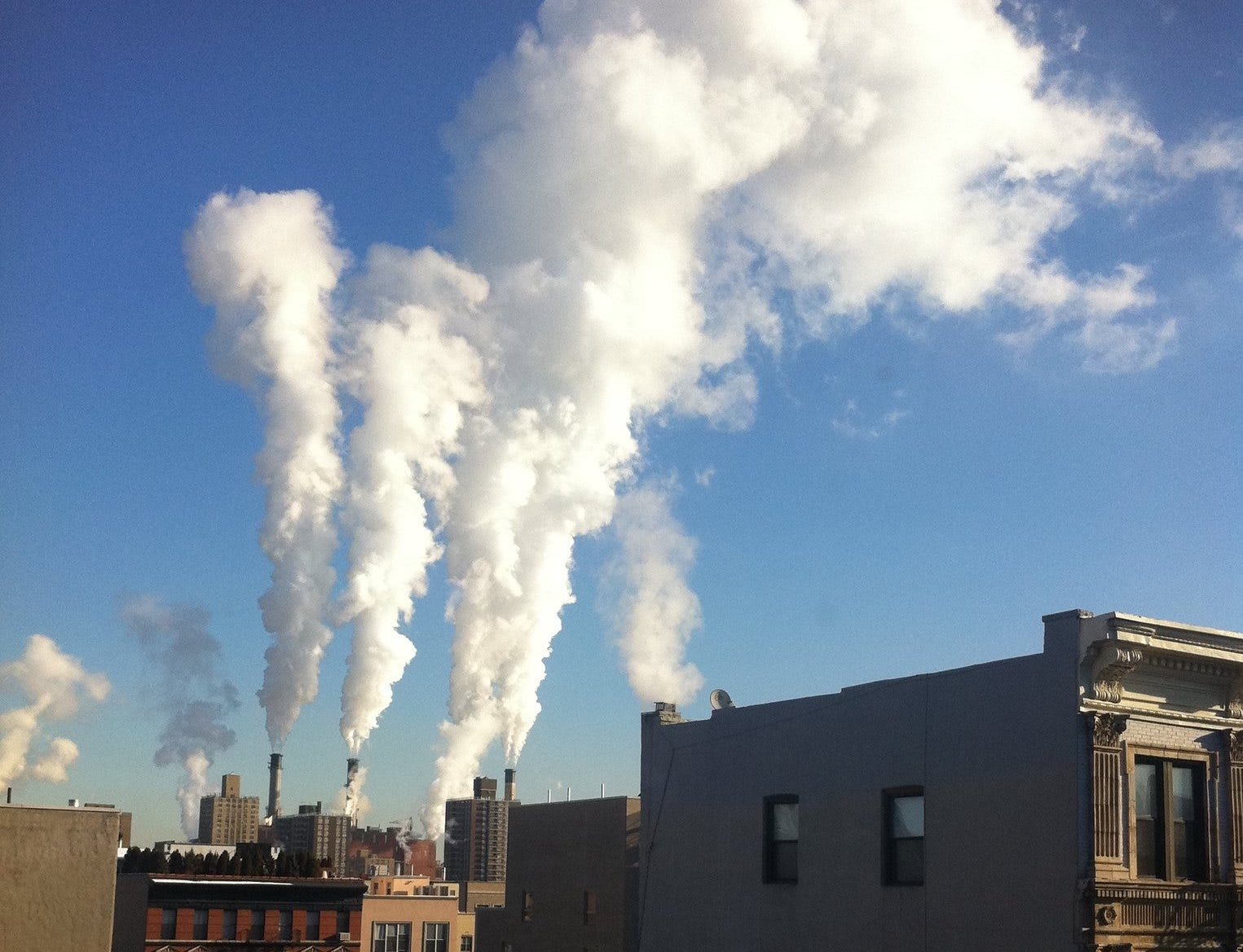
Now that you know about the potential damage of these emissions, where are they coming from? The vast majority of it is coming from energy use, but other sectors are contributing too. And energy consumption is complicated: There are many different ways energy is consumed that goes beyond simply transport and HVAC use. For instance, iron and steel production, which usually uses coke, a cooked-down version of coal, is a major portion of energy emissions, as is fertilizer production, which releases nitrous oxide (N2O), and produces 2% of all carbon-equivalent emissions. Fertilizer production, by the way, typically uses methane gas (“natural gas”) as a feedstock.
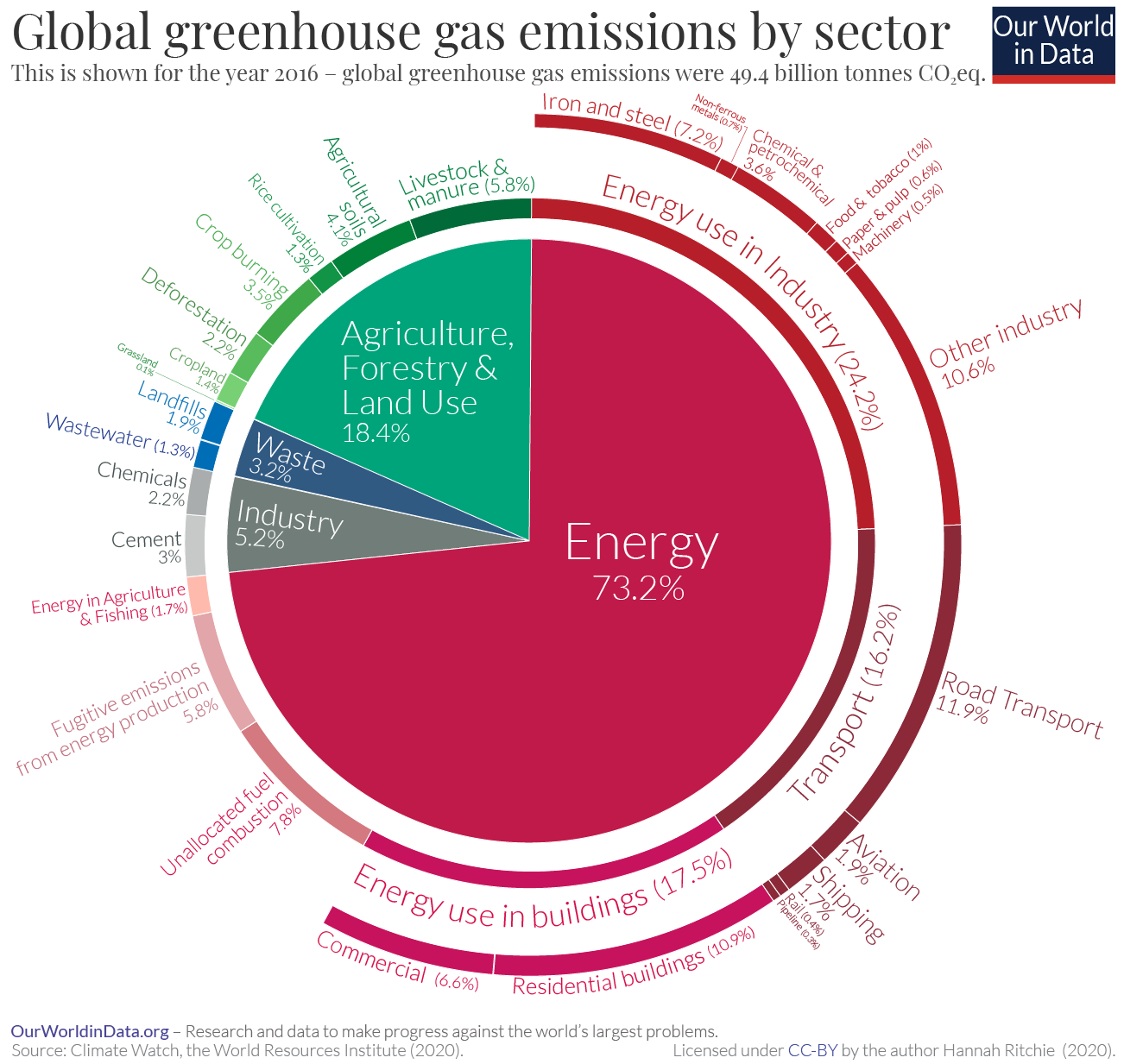
Emissions by sector are a bit different in the United States, which spends less on industry and agriculture, likely because our systems are more efficient, and much more on transportation, because we love our cars so much.

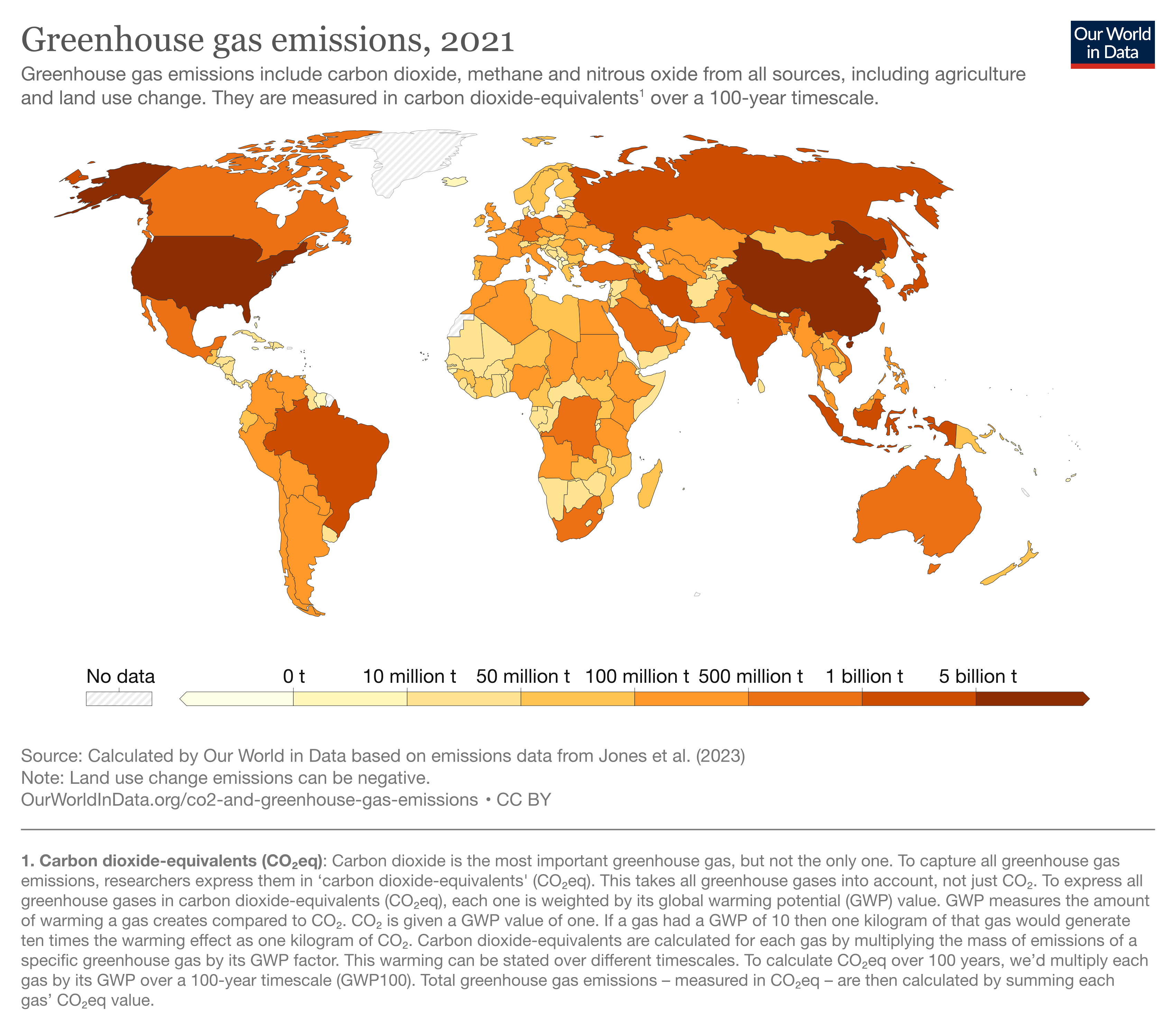
Then, there’s the question of where GHGs are coming from. The top emitters (as of 2021) are China (25.1%) the U.S. (10.8%), India (7.1%) and Russia (4.4%). But China and India continue to increase their annual emissions, while the U.S. and Russia are decreasing on an annual basis.
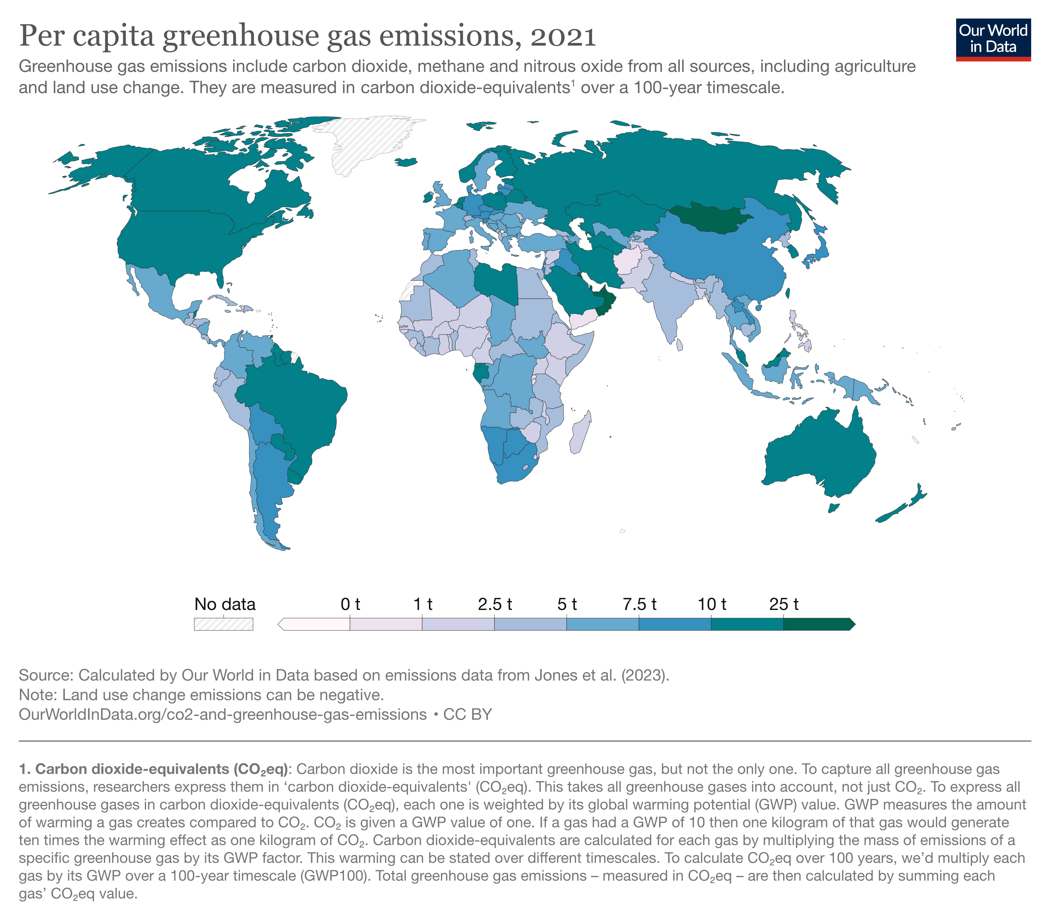
But, India and China (and most developing countries) will quickly point out that their emissions are relatively low per capita, even though they have lots of people. Of the big countries, the U.S. has the worst emissions per capita, 17.5 tons of carbon-equivalents per year, while China is just 9.6 tons/year and India is 2.8 tons/year.
Finally, let’s talk about something uplifting: What are the best ways to reduce all these emissions? Thankfully, the U.N.’s Intergovernmental Panel on Climate Change (IPCC) most recent report includes a helpful graph of where we could look for improvements. Items in blue are the least costly, and as you scale up from yellow, to orange, to red the improvements become more expensive.
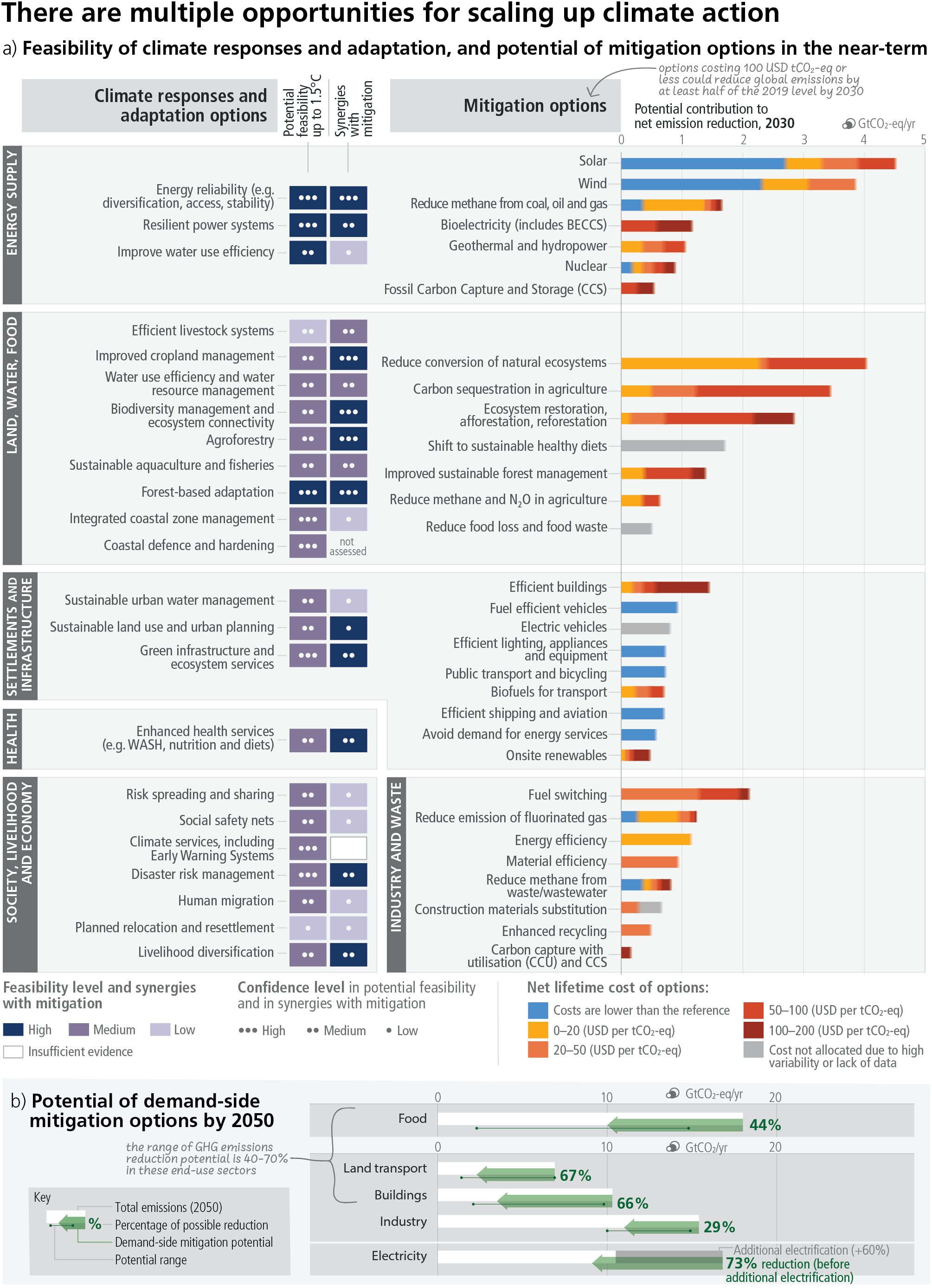
Not surprising is that more efficiency, using bikes, solar and wind energy are the most effective. But saving and restoring large forests as well as getting carbon sequestration going are expensive – yet have the most potential impact. So now we know what we need to do.
You made it to the end of the newsletter! Did you know Ukraine is using cardboard drones?